Sandthemall has some really interesting comments. What an interesting occupation which I guess is designing how things look. And with so many really amazing looking things out there you would think the attractiveness of how things look would lure people in and make them feel good before they purchase and would entice audio component manufacturers to step their game up. People who buy audio equipment do have a sense of taste and are not all resigned to say only the sound matters.
So manufacturers do not invest in the appearance of the product and there are exceptions of course. We all have our superficial side and a side of substance and many of us are interested in the quality of components. So how much are they really spending on what goes inside the box, how much can they get away with by diminishing the Quality of the inner workings of audio gear.
we can see the exterior of audio gear and the lack of functionality Of the remote control at times which is incredibly annoying. but How do we know what’s going on inside the box. How much are they spending on all the parts, how much are they getting away with. Attenuators, capacitors, wiring connections, Transformers, cabinets, etc, there is limited information on all this when you read about what you’re going to purchase aside from everything you’re reading that most do not understand.
My guess is that the electrical parts inside the box are less than 10% of the sales price. How often do you read in marketing descriptions proclaiming which parts are really fantastic and have cost a lot of money for the manufacturer. And when you do see a cost referred to it’s not very much in the scheme of things and what about the other things. It’s all touted as something wonderful as if something is being sacrificed by the manufacturer in making a product, how thankful we should be - if I’m spending North of $10,000, 15,000 or $20,000 I would hope they’re spending good money on the materials.
|
"One does not see what is in front of their eyes, one sees what is behind their eyes"
...or the more common truism "Beauty is in the eye of the beholder"
|
Counterexample: Nagra HD Pre.
![Nagra HD PREAMP preamplifier | Hi-Fi News]()
|
Many Audiophiles are dated and ugly. Why is this?
We prefer experienced and classic looks.
|
Cary is very nice but the problem is it doesn’t offer a fully functional remote. How stupid is that what is wrong with these guys?
|
PS Audio equipment are designed to look nice, compatible with each other & look like high quality gear, equipment. Buy, all!.
|
|
My Rogers integrated and phono pre look so cool that several female non-audiophiles have said, “ooh” and “ahh”. This was unprecedented in my experience. It also contributes to domestic harmony.
|
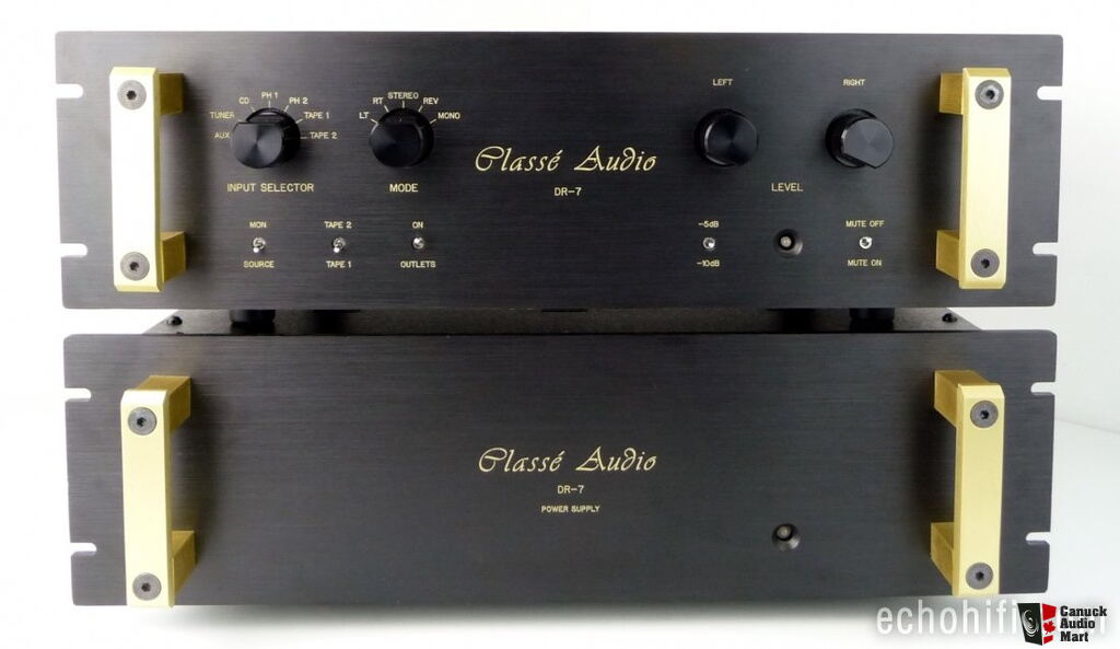
That classe stuff embodies everything i hate about US design.
Sharp edges and corners- terrible feng shui. Ye olde tourist trappe script- urgh.
Oversize faceplates, rack mounts that noone uses, unsoftened brutalism throughout, no. Just no
|
One person's sexy is another person's ugly, and vice versa.... People do have different aesthetic tastes, after all...
|
|
Pre-amps are engineering products built to do a job. For most that job is not to look beautiful. As most here have said, the important job is to process signals accurately and without unwanted artifacts.
ARC epitomises that, having sold amps for more than 60 years that all look pretty much the same externally. I have no issue with that. It cements brand image. The visual aesthetics are entirely functional, but excellently executed in terms of materials and build quality. In fact I like it.
What we really don't need is bling for the sake of bling. Amplifiers are not art objects. D'Agostino falls for that, although he didn't when he ran Krell. And he's certainly not the worst.
But let us be thankful the bling hasn't gone as far as it has in turntables, where nearly all high-end units are grossly over-designed, over-weight and over-priced. For goodness sake, all they have to do is spin a record.
|
My last pre with digital volume was a McCormack , and while it was good I missed the traditional rotary volume knob. I like tactile switches , buttons, knobs. My preamp has way more functionality than it's looks suggest . It has conventional controls, remote vol, mute, and Mono, it can drive 2 stereo amps via RCA and 2 via XLR , HT passthrough, plenty of inputs. Unreal sound quality ..... that was a good buy
|
Forget looks.... let's talk functionality! What's up with the new high end preamps that have NO controls at all. How is that a preamp?? Also, many just have one control knob, but no labeling. How would you ever know how to turn on the stereo without some instructions??
|
I love ugly gear too..... some of my best sounding equipment has been plain jane.
|
Looks are important. Surely speakers are most prominent and the most important visual. Personally, I find most box speakers somewhat unattractive. At least the square box ones. Sonus Farber has sculpted boxes which are very aesthetic pleasing. For box components, I have always liked AR. They are always substantial looking. But when it comes to performance of any speaker of component, if they sound good they become good looking… sort of.
|
To me the epitome of a beautiful preamp is the MBL 6010D.

|
While I am not a fan of gear that looks like it was created by amateurs from articles in Popular Electronics I think that a lot of vintage gear is nice looking.
Some of mine:


|
I like the Audio GD, fully balanced, which is ~ $3300 from Underwood HiFi. There's an ad for it today
|
|
Alas, this is true of many audiophiles.
We must be careful what we ask the mirror.
|
|
The Shindo pre-amps are very classy looking, aren’t they? Timeless, understated tasteful elegance.
|
Couldn't agree more wrt VTL and ARC.
What were they thinking?
The VTL 7.5 should be on my radar, but there is no way I'm buying something that looks like a bad 80's vcr, sharp edges and all. The Siegfried power amps look like 90's pc's. What a wasted opportunity. Much like Wilson speakers...urgh.
The US companies are the worst offenders aesthetically. But a peek in many US living rooms shows a similar indifference to design and ergonomics.
Brutalism rules, apparently
|
I’m an industrial designer and I think Schiit stuff looks very derivative.
It’s minimalist but kind of blah...easy on most eyes. I really like Audio Research aesthetics...especially the older stuff. I think McIntosh and Luxman look wonderful...I like older Conrad Johnson stuff.
But then again, I like the look of my Technics 1200G...so what do I know...
I do think the heyday was the 70s. There were a lot of industrial designers on the books back then...now it’s driven more by marketing...so that’s why everything looks agreeable but not damn fine.
I am not a fan of the current state of marketing as you can see.
|
This thread gets my vote for most stupid thread of the month.
|
I don't care how preamps look, I don't care how speakers look. I mix black and silver components. I mix red back light with blue. All I care about is, how does it sound. I admit that glowing tubes in the evening can be somewhat intoxicating.
|
|
High quality audio electronics are costly and will occupy prominent places in the household landscape, so it's important to buy products that not only sound as you wish, but also convey the visual impression of having been acutely designed for their specific functions. Knobs, switches, and lights must positioned and sized in proportion to the nature of their individual functions and their importance in relation to one another and to the the unit as a whole. Fortunately there are few I consider to be as "dated and ugly" as their owners (nerdy old white men). One candidate would be the current Conrad Johnson line -- black chassis, gold-wash faceplate, all buttons identical irrespective of function. Yet I'm sure this very thing is someone's ultimate cup of Ceylonese.
|
@perazzi28
"good preamplifiers are few & far between"
I agree. I went through about 20 before finding one I could live with long term.
|
@reubent “Many Audiophiles are dated and ugly. Why is this?”
Good observation.
That is because the sound of equipment gets better with cost and the only ones that can afford really good stuff are old farts. So over time you collect old guys.
|
Preamp aesthetics may or may not have any bearing on it's sound quality.
I've stated this before and will repeat it here again.."good preamplifiers are few & far between".
Many are flawed in different areas and it is difficult to execute everything to make a great sounding preamp.
|
|
I think it is really a matter of personal taste. I don’t think the Schiit looks all that great.
I do like the look of my Luxman CL-35 III and Luxman CL-38uC preamps, as an added bonus they also have great sound
|
Many Audiophiles are dated and ugly. Why is this?
|
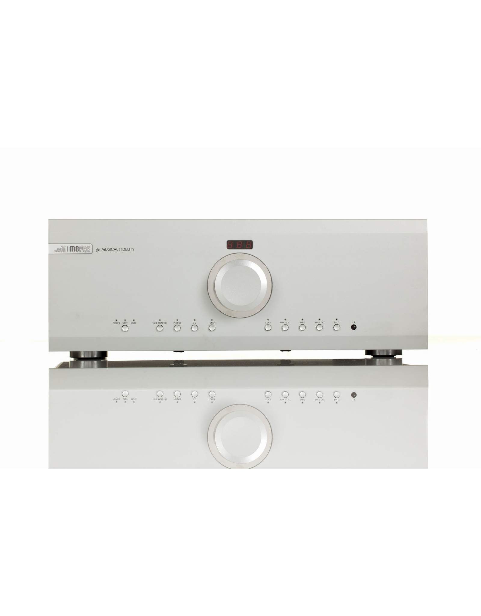
 II'm rather fond of my Musical Fidelity Ms8 preamp and even the wife gave it compliments when unboxing saying it's beautiful ! II'm rather fond of my Musical Fidelity Ms8 preamp and even the wife gave it compliments when unboxing saying it's beautiful !
|
Seems like you want to impress friends rather than have good sq. Who cares what a preamp looks like, it’s the sound that counts. IMO, what you called high end preamps are just ok in my book, and some of the preamps you stated as ugly or weird are very good sounding.
|
It is VASTLY more important to me that my preamplifier - amplifier - DAC - streamer - CD transport/player - speaker array - every single one of them - must LOOK good (how they SOUND pales in importance by comparison)!
My family and friends simply MUST gasp in astonished awe and delight whenever they feast their eyes on the STUNNINGLY GLORIOUS SIGHT of my gleaming high-end audiophile gear each and every time they enter my listening - er, viewing - room.
|
Yogiboy I can't see any knobs how do you turn it on? 😋
|
Yogiboy: hat is a great looking preamp. Does it have XLR outputs?
|
I really like the industrial design of my ARC LS15 tube pre amplifier
I bought it in 1995 and still listen to it to this day But moreover l appreciate its build quality and tactile feel Oh it's also made in the good old USA
The same applies to my VAC PA 100 100 tube amp that l also bought when l bought the ARC LS15
|
Audiophiles discussing whether audio components are pretty and/or sexy -- is this a rejected SNL skit?
|
Eventually, the better it sounds, the better it looks!
|
|
Aside from Preamps and Amps:
Did Apple designers ever get into Audio Equipment?
Sony made some very nice PCs and Laptops, their Audio not as elegant it seems.
Recently I did searches on hifishark for 'Tandberg', and 'Bang & Olufson' and 'Bang and Olufson', some very cool designs I was and was not aware of.
Luxman has had a simple, practical, still elegant design look over the years
"Italian Speakers' yields some beauties
|
Beauty is in the eye of the beholder, as they say.
|
Some manufacturers believe sound and value are more important than looks to many including I. Wyred4sound is a perfect example of that and I thank them.
|
@ghdprentice +1
As a group the people that can afford high end audio components we dictate through purchases what manufacturers can sell profitably.
As I like to say, we vote with our wallets.
Visual appearance is probably more of a factor with speakers than with electronics, which are often tucked away in a rack or cabinet.
|
My Zesto Leto is sexy as hell, but I bought it because of the rear panel
|
now I am making (outsourcing to several companies) an exclusive enclosure for the power system.
Bronze , bone , exotic wood ... development at the jeweler , foundry , CNC milling ...
It turned out to be quite expensive! - the mass market, on the contrary, is trying to save money (for this reason, the external design is very modest)
|
CJ was dated when I first said no to my sound advice salesman in the early 90s. He didn’t understand. Fortunately the Krell KSA -100S came out soon thereafter (I did with Adcom until then). Using McIntosh Hybrid these days and it looks the part. The brand was too staid for me back then. Wadia, Rowland, Acurus, Gryphon, Levinson have done it for me as well as Krell and Mc. Schiit is just too lacking in style and size to do anything towards a purchase. I’ve looked, but won’t listen.
|
Pretty is in the eye of the beholder. There’s ’art’ that sells for multiple millions that I don’t think pretty.
’Outdated’ ... well ... maybe after some 100 years of evolution in analog signal amplification circuitry it has come to a somewhat optimal design, from where it’s very hard to improve on it any further, or to find a whole new, better, design principle.
Technological progress has brought us transistors, IC’s, and nowadays even powerful digital processing on a chip. Much more sound shaping is possible in the digital realm and this is widely used in the sound studios where the digital master recordings are created. Yet, for play back many listeners still prefer the 'ancient' analog (discrete component) (tube) technology.
All a matter of personal taste.
|
Yeah, lame topic but so what? Schiit gear works very well for my tastes regardless of how it looks (my Freya looks cool though), and don’t let women with no pants sit on your carpet...trust me.
|
The Anthem STR although solid state, is not pretty, but pretty damn sexy.
|


 II'm rather fond of my Musical Fidelity Ms8 preamp and even the wife gave it compliments when unboxing saying it's beautiful !